
Your design is almost there. The colors work, the layout feels balanced, and then you reach the text. It sits flat and doesn’t match the style you pictured.
You start clicking through Canva menus looking for a curve option; sure, it exists somewhere, but it is not where you expected it to be.
That is not a design skill issue. It is simply a matter of finding the right setting. Once you know where Canva places it, the process becomes much easier.
You will learn the exact steps to curve text, how to do it from your phone, what to check when the result looks off, and a few solutions other creators found useful.
Where to Find the Curve Text Option
Canva doesn’t list curved text as a separate tool, which is why many users miss it at first. Most people expect to find it beside shapes, text styles, or layout options, so they keep looking in the wrong places.
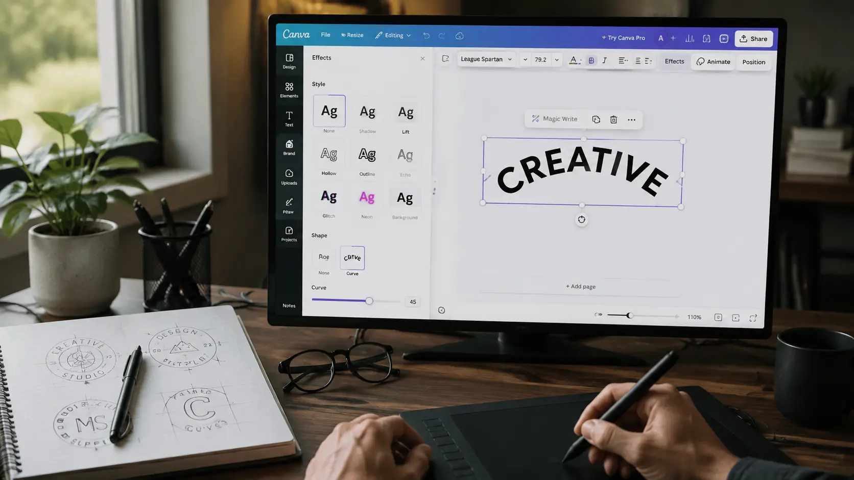
The curve setting sits inside the text effects menu. After selecting your text box, open the editing options and look under Effects to find the adjustment.
The exact features available can depend on Canva updates and account settings, but the curve option is found through the text editing tools rather than a separate design panel.
Once you know where it sits, creating curved text only takes a few adjustments.
How to Curve Text in Canva
Once you find the setting, shaping your text only takes a few small moves. The main goal is not just to add a curve, but to keep the text readable and balanced.
1. Select and Prep Your Text
Open the Canva design you are working on or create a new one. Add your text box, then click directly on the text so Canva selects the correct layer.
Before applying the curve, consider your font choice. Fonts with simple shapes and balanced spacing usually maintain their appearance better after bending.
Decorative fonts can still work, but they may need more spacing adjustments to stay clear. If you want a reference point for legible, well-structured typefaces, Google Fonts offers a free library that works well for this kind of testing. Making this choice first saves time later.
2. Apply and Direct the Curve
With the text box selected, open the Effects menu and choose Curve. You’ll see a slider that controls how much the text bends. Moving it in one direction creates an upward arc, while moving it the other way creates a downward curve.
A gentle curve often works best for professional designs, while stronger curves can create a playful look for stickers, badges, or creative graphics.
3. Tighten Spacing Until It Reads Clean
The curve iCurve is only part of the result. Small spacing adjustments often decide whether the design looks polished or uneven. Adjust letter spacing if characters feel too close or too far apart; increase or decrease font size.
If the curve is crowded, resize the text box if the shape needs more room to breathe. Fonts with even spacing usually hold their shape better than narrow decorative styles.
Once these three adjustments feel natural, curving text stops being a guessing game and becomes a quick habit. The same steps carry over almost exactly when you’re working from your phone instead of a desktop.
How to Create Circular Text in Canva
A single curved text box creates an arc, which works well for headings and decorative elements. For logos, seals, badges, and product labels, however, you’ll usually want text that forms a complete circle around a central design.
Use Two Curved Text Boxes
The easiest way to create circular text is by usingtwo separate text boxes.
- Add the first text box and apply an upward curve for the top half.
- Create a second text box and apply a downward curve for the bottom half.
- Position both around your logo, icon, or empty center space until they form a balanced circle.
This approach creates the appearance of one continuous ring and is commonly used for logos, stickers, packaging, and badge-style designs.
Balance the Top and Bottom Text
The circle looks most professional when both text sections feel evenly balanced.
- Keep similar spacing above and below the center.
- Adjust the curve amount independently for each text box, since the same curve value may not align perfectly.
- Match the font size and letter spacing to create a consistent appearance.
- Use the same center point for both text boxes so the circle looks symmetrical.
Small positioning adjustments usually make the biggest difference. Once both halves align cleanly, you’ll have a polished circular text design that works well in both digital and print projects.
Troubleshooting Curved Text in Canva
A curve that looks off usually isn’t broken; it just needs one small correction. Here’s what to check when the shape doesn’t match what you had in mind
- The Option Isn’t Showing: Option > Curve > Curve: Option> Curve is missing from Effects; check that your text box is selected. Canva only displays text effects when you are editing an active text layer. Refreshing Canva or updating the app can also help if the menu does not load correctly.
- Letters Look Stretched or Crowded: This is usually caused by the combination of font choice and curve strength. Try reducing the curve amount, increasing letter spacing, or switching to a font with cleaner letter shapes. Some fonts naturally handle curved layouts better than others.
- The Curve Resets After Download: If the design changes after export, check the final size and format you selected. A layout that looks balanced while editing may appear different when resized for another purpose. Previewing the final version before sharing can help catch spacing problems.
None of these problems require starting the design over, just a quick adjustment in the right place. From here, it helps to see what worked for other people who ran into the same thing.
What Canva Users Recommend
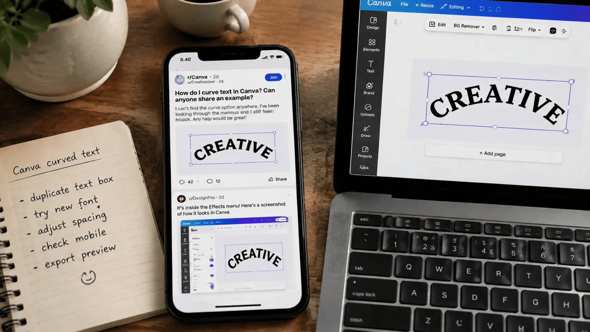
Many creators run into the same challenge of trying to match smooth curved text designs they have seen elsewhere. Community discussions often focus on small adjustments that make a noticeable difference.
One common workaround is duplicating text boxes to create tighter circular layouts instead of trying to force everything into one curve. Curves recommend changing fonts when letters appear distorted, since some typefaces naturally maintain their shape better.
Testing different curve strengths before finalizing a design is another useful habit. Seeing the full layout at a smaller scale often makes it easier to judge whether the text feels balanced.
The Canva Community is a useful place to compare designs and see how other creators solved similar problems.
Once the technique feels familiar, curved text becomes useful in many types of projects.
Note: Curved text works well for logos, social media graphics, invitations, stickers, and packaging. Even a small curve can make a design look more balanced and polished.
Final Edit
A flat line of text does not have to limit your design. The solution is usually simpler than it first appears: find the right setting, adjust the curve, and fine-tune the spacing until it feels natural.
None of this requires advanced design training, just knowing where Canva placed the option.
Once you understand how to curve text in Canva, you can turn simple layouts into designs that better match your original idea.
A small adjustment can change the final result more than you would expect, especially across logos, invitations, or social graphics that need a little more personality.
Open Canva now, pick that half-finished design, and curve the line of text you kept skipping over.
Try it on your next project and see how much more finished it feels once that one detail finally clicks into place.
Frequently Asked Questions
What Happens If You Curve Text Inside a Locked Template?
Locked templates usually prevent direct editing of certain elements, including text effects. If the text cannot be selected, duplicating the design first or requesting editing access may allow you to apply the curve effect normally.
Why Does the Same Design Look Different on Another Screen?
Different screen sizes, resolutions, and display settings can all affect how curved text appears. Checking your exported file at its intended final size helps confirm the design looks consistent across every device.
Is there a Limit to How Many Curved Layers You Can Stack?
Canva does not set a specific limit on curved text layers within a single design. However, stacking too many overlapping elements can slow down editing and create a cluttered, harder-to-read final layout overall.